Karp Medical & Karp Productions
Karp Medical is a family-owned business based in Sunnyvale, California, specializing in high-quality, pre-owned medical equipment. With a mission to support smaller medical device companies, Karp Medical helps eliminate long lead times by making top-tier equipment more accessible and affordable—empowering providers to focus on care and innovation.

Brand Designer

Brand Identity Refresh
Visual Language Refresh
Brand Guidelines

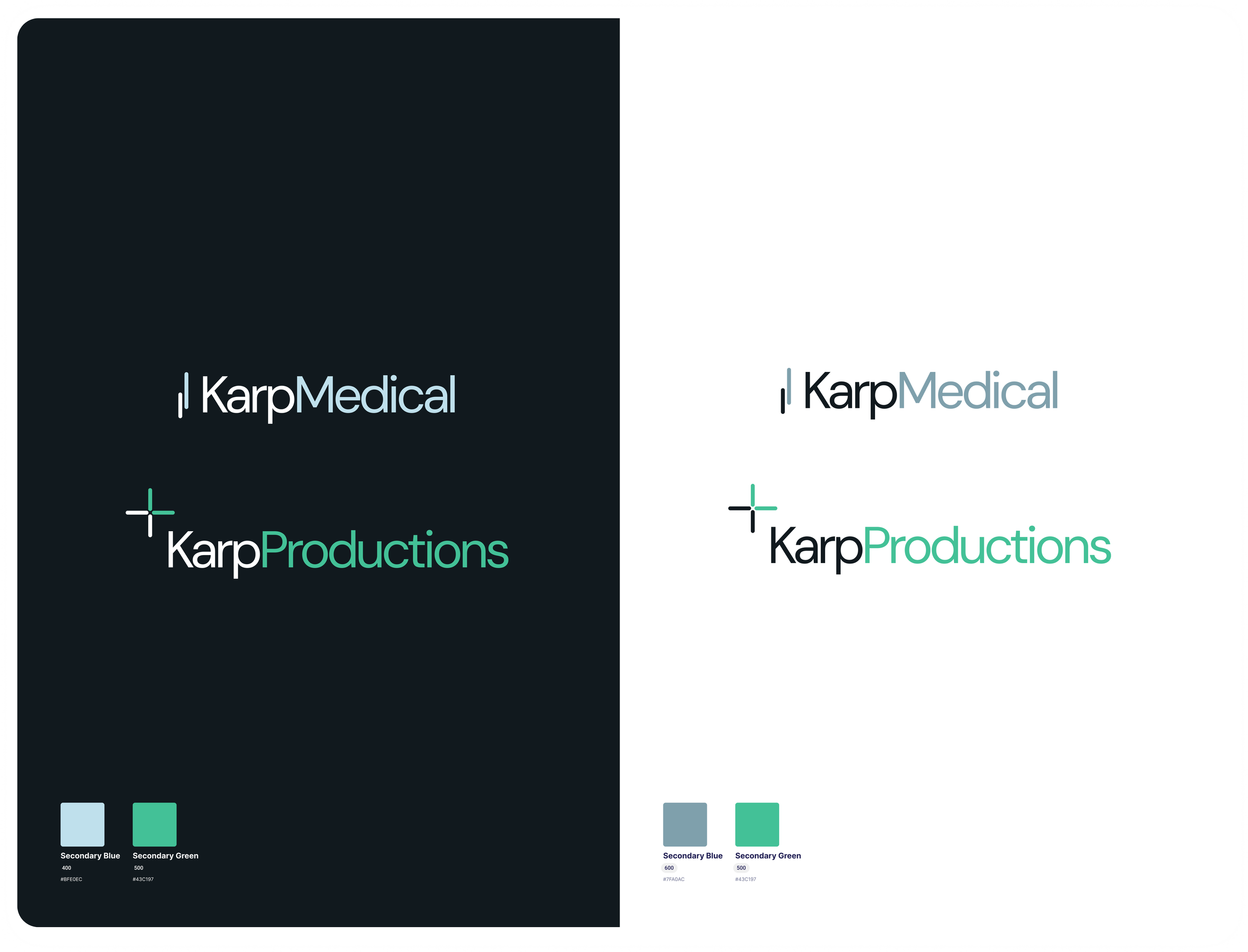

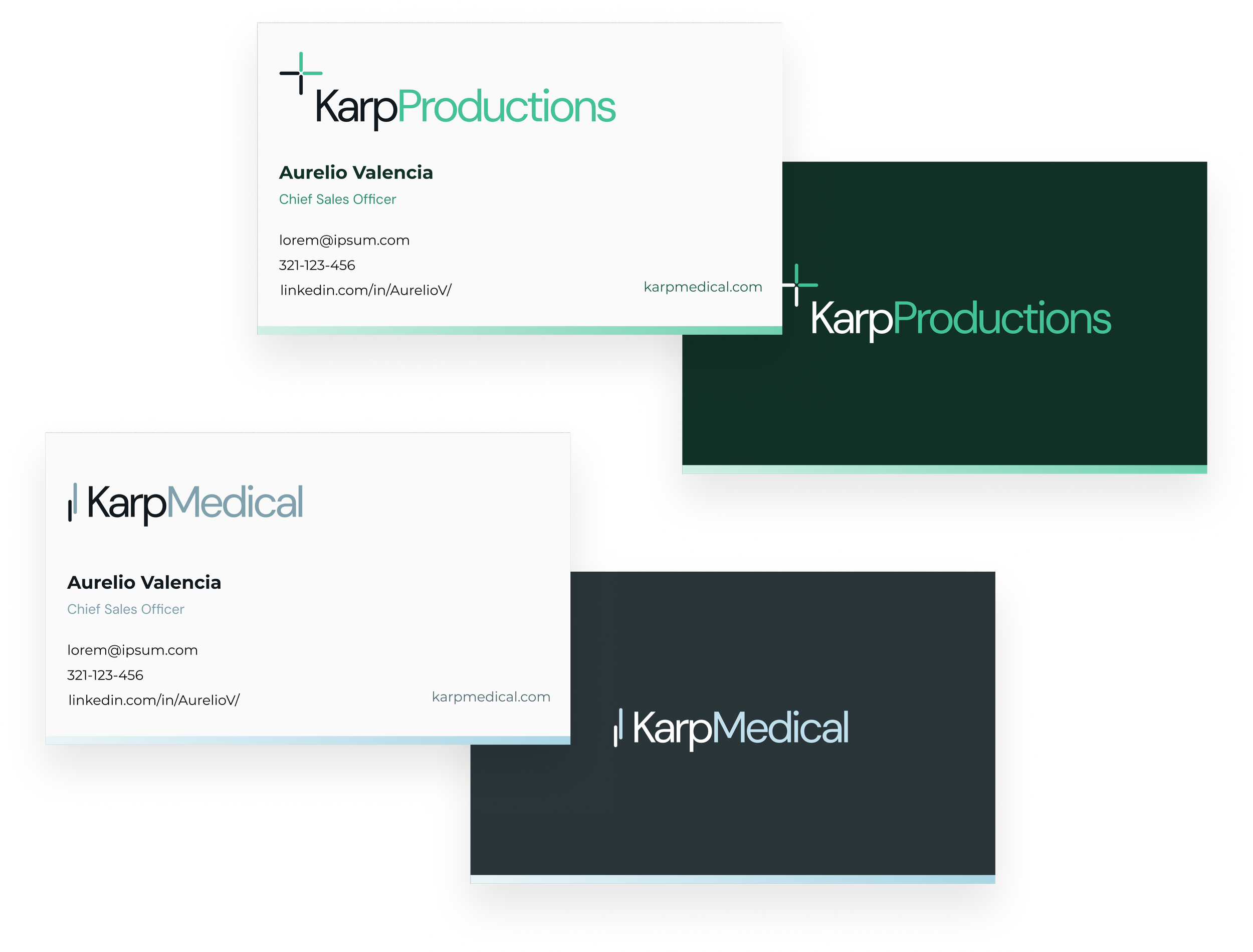
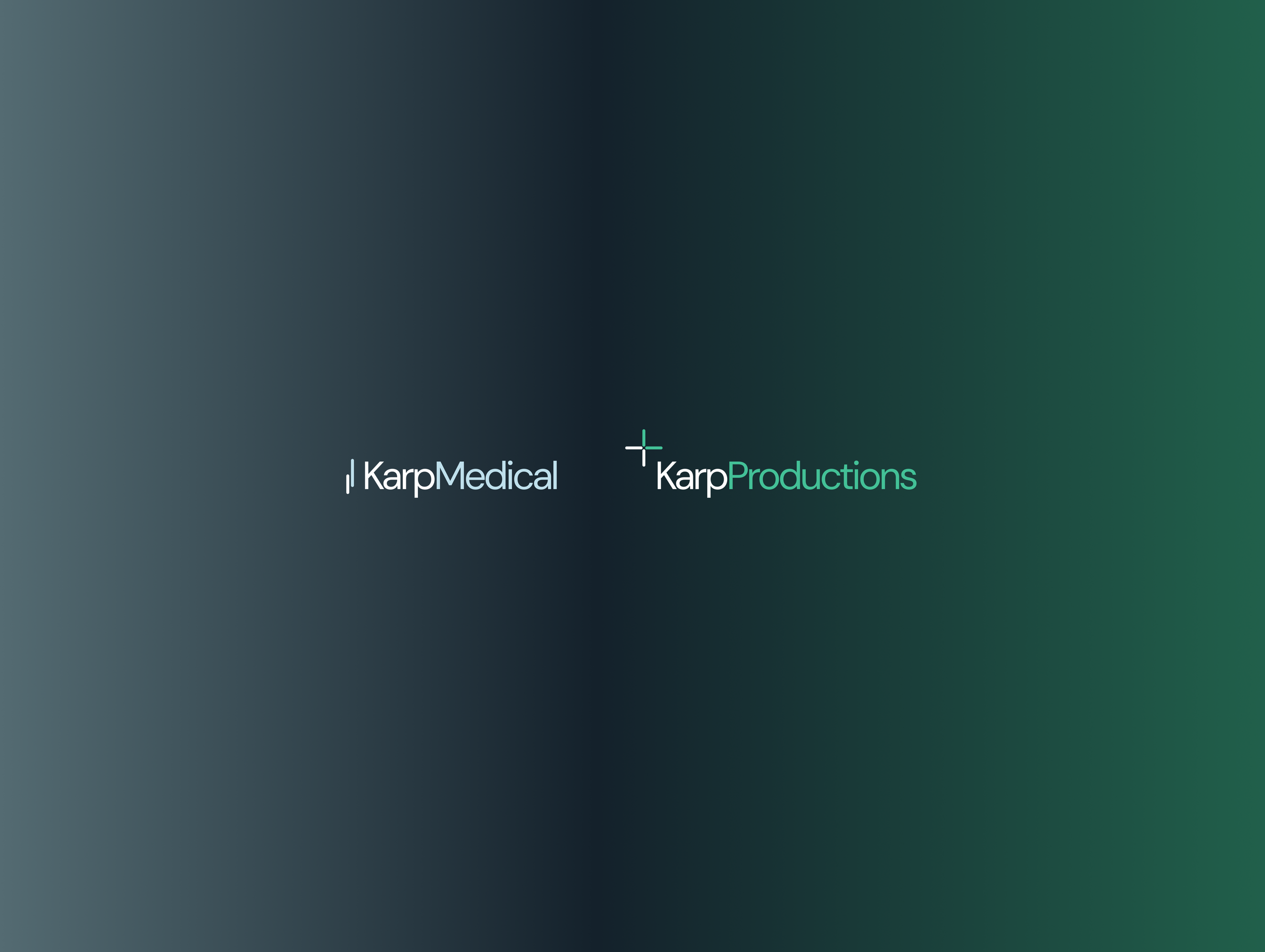
The Karp Medical and Karp Productions logos form a cohesive brand system through the use of a shared visual motif: a rounded square element that subtly anchors both identities. This minimalist geometric mark serves as a unifying symbol, signaling that while the two entities serve distinct industries, they stem from a common brand ethos rooted in clarity, structure, and precision.
Karp Medical features a clean, modern wordmark in a cool, clinical light blue, reflecting trust, dependability, and professionalism—qualities essential in the medical field. The rounded square here echoes stability and care, aligning with the company’s mission to provide accessible, high-quality equipment.
Karp Productions builds on the shared brand language but introduces a vibrant green tone, evoking creativity, growth, and forward thinking. The typography remains consistent in structure but is more expressive through the use of color, pointing to the brand’s dynamic nature within media and production.

Typography & Color
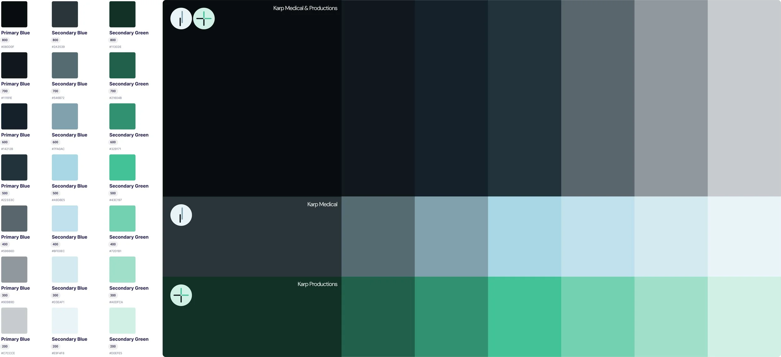
The Karp brand system uses typography and color to create both distinction and cohesion across its sub-brands. A clean, modern sans-serif typeface is used consistently to convey clarity, trust, and professionalism. Color plays a key role in differentiation: Karp Medical is anchored in a light, clinical blue that reflects precision and reliability, while Karp Productions introduces a fresh green that speaks to creativity and growth. An overarching deep blue—distinct from Karp Medical’s palette—acts as a connective thread, offering a unified visual foundation that ties both identities together while allowing each to express its unique focus.

Gradients
The Karp brand uses gradients to create depth, movement, and a modern digital feel across its visual system. Gradients blend primary and secondary hues—like deep blue into teal or soft green into mint—to reinforce brand differentiation while maintaining a unified, fluid aesthetic across Karp Medical and Karp Productions.

Gradient Use cases


Applications in use